Diagrammatic representation of data is a method of presenting data visually using shapes, symbols, and illustrations. Unlike detailed numeric or textual data, diagrams provide a simplified view that highlights patterns, relationships, or differences in the data.
as we describe earlier the classification of data in biostatistical studies. this chapter is like extension of classified data in order to better understand the data or explain the data.
Let’s try to understand with example one example
Suppose you wanted to know the distribution of different blood types in a population. Listing detailed number with each blood type (e.g., A, B, AB, and O).
A bar diagram could show each blood type as a separate bar, where the height of the bar represents the percentage of people with that blood type (e.g., A, B, AB, and O). Instead of listing detailed numbers, the bar chart quickly conveys which blood types are more common and which are rare.

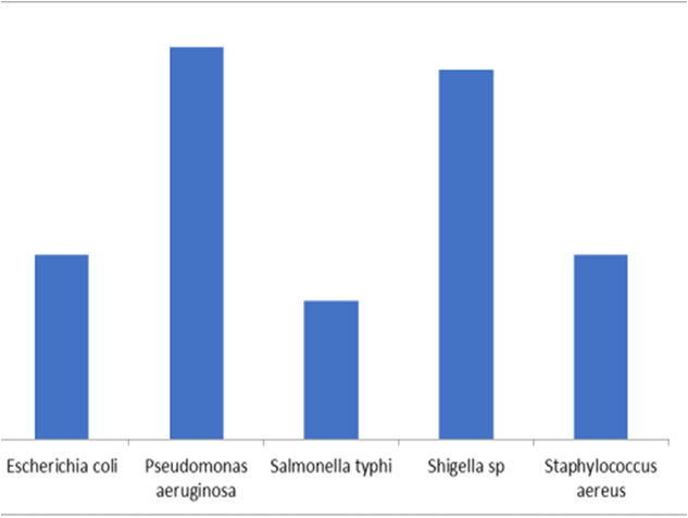
Table of Contents
Application of diagrammatic representation of data
- Biology and Health: Diagrammatic representations are essential in biology for visualizing data in fields such as genetics, microbiology, and ecology. Diagrams can show the spread of diseases, population distributions of species, or changes in genetic frequency.
- Education: Diagrams are widely used in teaching to make complex biological processes, such as cell division or metabolic pathways, easier for students to grasp.
- Research and Healthcare: Diagrams can illustrate patient data, such as the prevalence of certain diseases across age groups, helping healthcare providers understand health trends quickly.
The objective of diagrammatic representation of data | importance of diagrammatic representation of data
- Simplifies Large Datasets for Quick Comprehension.
- Makes Comparisons Between Data Categories Easier.
- Engages the Audience by Providing a Visual Summary.
- Helps to Communicate Data to Non-specialists effectively.
- Simplifies complex information, making it easy to interpret.
Types of diagrammatic representation of data in biostatistics
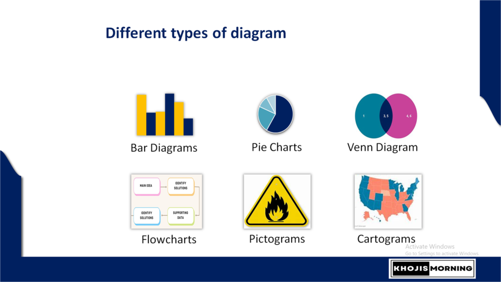
there are different types of diagrammatic representation
- Bar diagram
- Pie charts
- Venn diagram
- Flow chart
- Pictograms
- Cartograms etc.
among these diagrams, Bar diagram and pie chart, flow chart are very common in our daily/lab task. like we used to make flow chart for different experimental method.
Diagrammatic representation of data Bar diagrams
- Bar diagrams are used to represent data with rectangular bars where the height (or length) of each bar corresponds to the data’s value. They are ideal for comparing quantities across categories.
- In Biology: Bar diagrams can effectively display categorical data, such as comparing species diversity across different ecosystems.
- Example: A bar diagram could show the number of plant or animal species in various ecosystems like forests, grasslands, and wetlands. Each bar represents an ecosystem, and its height represents species count.
Types of bar diagram
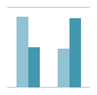
Vertical Bar Chart
Displays bars vertically, with categories on the x-axis and values on the y-axis. It’s great for comparing different categories.
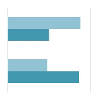
Horizontal Bar Chart
Displays bars horizontally, with categories on the y-axis and values on the x-axis. This format is useful for longer category names.
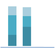
Stacked Bar Chart
Combines values within a single bar by stacking different segments. This is useful for showing the total and the contribution of subcategories.
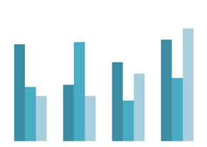
Grouped Bar Chart
Shows bars for different categories side by side for comparison, often used for showing subcategories within a main category.
Diagrammatic representation of data pie diagrams
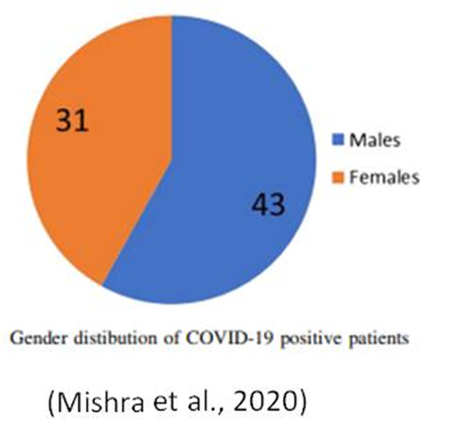
- Pie charts display data as segments of a circle, where each segment represents a proportion of the total. They are helpful for showing the composition of a whole.
- In Biology: Pie charts are useful for displaying proportions in biological data, such as genetic variation or population demographics.
- Example: Gender distribution of COVID-19 positive patients
Pictograms
- Pictograms use icons or symbols to represent data quantities, making it easy to visually compare frequencies or counts.
- Often used in infographics, pictograms are helpful for showing quantities like cell counts, population sizes, or colony numbers.

Flow chart
Flowcharts use shapes and arrows to represent a process or sequence of steps. They are especially useful in illustrating complex procedures or biological pathways.
Example: Preparation of plant extract.

source : Maceration Plant Extraction Explained: Unlocking the Potential
Cartograms
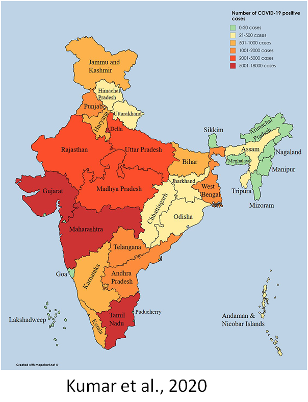
- Cartograms are map-based diagrams where areas are distorted to reflect data values, emphasizing the geographic distribution and concentration of data.
- Useful for illustrating the spread of species, disease prevalence, or genetic traits across regions.
- Example: Covid positive case
Rules for diagrammatic representation of data
- Clarity and Simplicity – The design should make data easy to understand at a glance, avoiding excessive detail or complicated visuals.
- When comparing the number of a species in various habitats using a bar chart, ensure each bar is clearly labeled, and avoid overloading the chart with too many categories.
- Accuracy in Scaling– Ensure that the scaling of diagrams accurately reflects the data proportions and differences.
- Example: In a pie chart showing the proportion of different blood types in a population, each segment should be proportional to the actual frequency of each blood type to avoid misinterpretation.
- Labeling– Label axes, sections, or categories clearly, and include a title that specifies what the data represents.
- Example: A flowchart of the stages of mitosis should label each stage (prophase, metaphase, etc.) to guide viewers through the process.
- Use of Color and Symbols– Colors and symbols can enhance readability but should be used consistently and purposefully, with a legend if necessary.
- Example: In a cartogram displaying disease spread, use a consistent color gradient where darker shades represent higher infection rates.
- Appropriate Selection of Diagram Type– Choose a diagram type that best represents the data’s nature and purpose.
- Example: Use a pictogram rather than a bar chart to represent the number of cells in different tissues visually, as it might engage viewers better.
Advantages and disadvantages of diagrammatic representation of data
advantages of diagrammatic representation of data
- Quick and Easy Interpretation – Diagrams allow viewers to understand complex data at a glance, making it especially useful in presentations or publications.
- Example: A pie chart representing the genetic composition of different populations makes it easy to visually identify the most common alleles.
- Comparative Analysis – Diagrams, especially bar charts and pictograms, make it easy to compare categories within a dataset.
- Example: A bar chart comparing antibiotic resistance levels across bacterial species shows clear differences between them, allowing easy comparison.
- Engagement and Retention Visual data representations tend to capture attention and are easier to remember, which is beneficial for educational purposes.
- Example: A pictogram showing the distribution of biodiversity in various ecosystems can keep students engaged more effectively than a table.
- Universal Appeal and Accessibility- Diagrams go above language barriers and are accessible to both specialists and non-specialists.
- Example: A cartogram of disease prevalence across countries can communicate effectively to a global audience without relying on text-heavy explanations.
- Highlighting Proportional Relationships – Diagrams like pie charts and histograms emphasize the proportional relationships between parts of data.
- Example: A histogram illustrating age distribution within a species can show if certain age groups are more prevalent.
Disadvantages of diagrammatic representation of data
- Less Detail: Diagrams may oversimplify data, omitting nuances.
- Data Limitations: Not ideal for detailed or very large datasets.
- Misinterpretation Risk: Poor design may lead to incorrect interpretations.
- Requires Balance: Must balance visual appeal with accuracy.
Conclusion
- Diagrammatic representation is a powerful tool for visualizing complex data, making it accessible and easy to understand for a broad audience. It enhances clarity, encourages comparative analysis, and helps highlight trends or patterns in biological data.
- o Diagrams come in various forms, each suited for different kinds of data. Common types include bar charts, pie charts, pictograms, and flowcharts. Selecting the right type is crucial for effective communication of information.
- o Practices like clarity, accurate scaling, proper labeling, and appropriate color use ensure that diagrams remain both accurate and engaging.